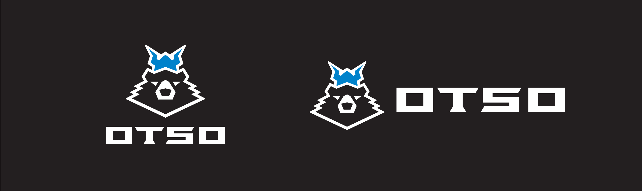
Otso Cycles
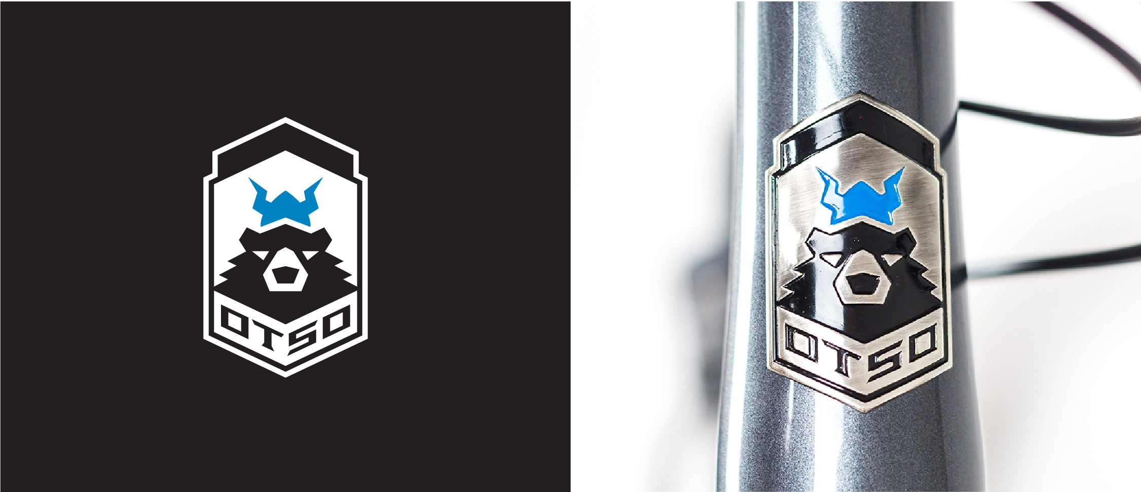
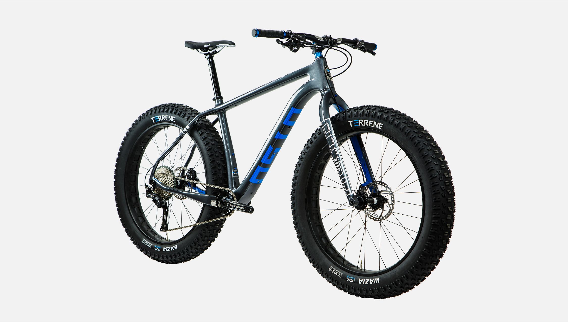
The name Otso derives from the bear king of the forest in Finnish mythology. It’s an appropriate name for a bike brand specializing in ergonomically and expertly engineered mountain and fat tire bikes. These bikes are light and fast, despite the hefty tires they are designed to hold. Their logo and identity celebrates the bear king as a symbol of adventure and an embrace of the wilder, harsher climates. The bear is made regal with a viking helmet and a somber expression, while the strength and elegance of the mark support the precision and care that go into making each bike.
Logo Design + Bike Graphics
CD: Brian Adducci
AD: Greg Brose
Photography: Brian Adducci, Ryan Krueger
Designed while at Capsule

Logo evolution
Starting a bit shaggier and a bit more king-like, this progression shows how the Otso bear came to life.

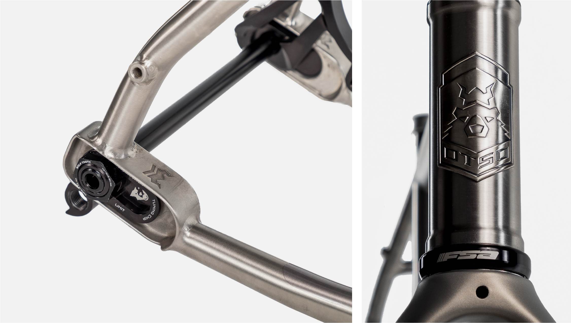
Fit to ride
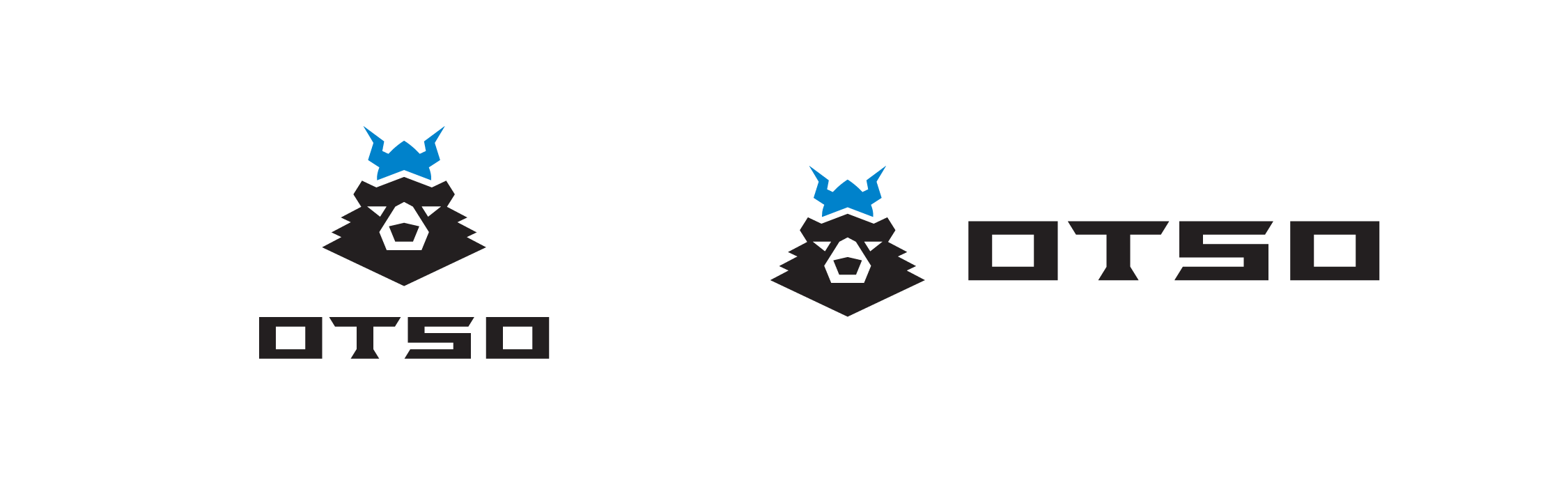
The simplicity and symmetry of this mark played an important role when applied to the bike itself. Not only did we need a strong corporate mark, it needed to work when molded, painted and used as a head badge. We also knew that the wordmark needed to be as distinct as the logo mark itself, allowing it take up a large part of the bike’s design.